
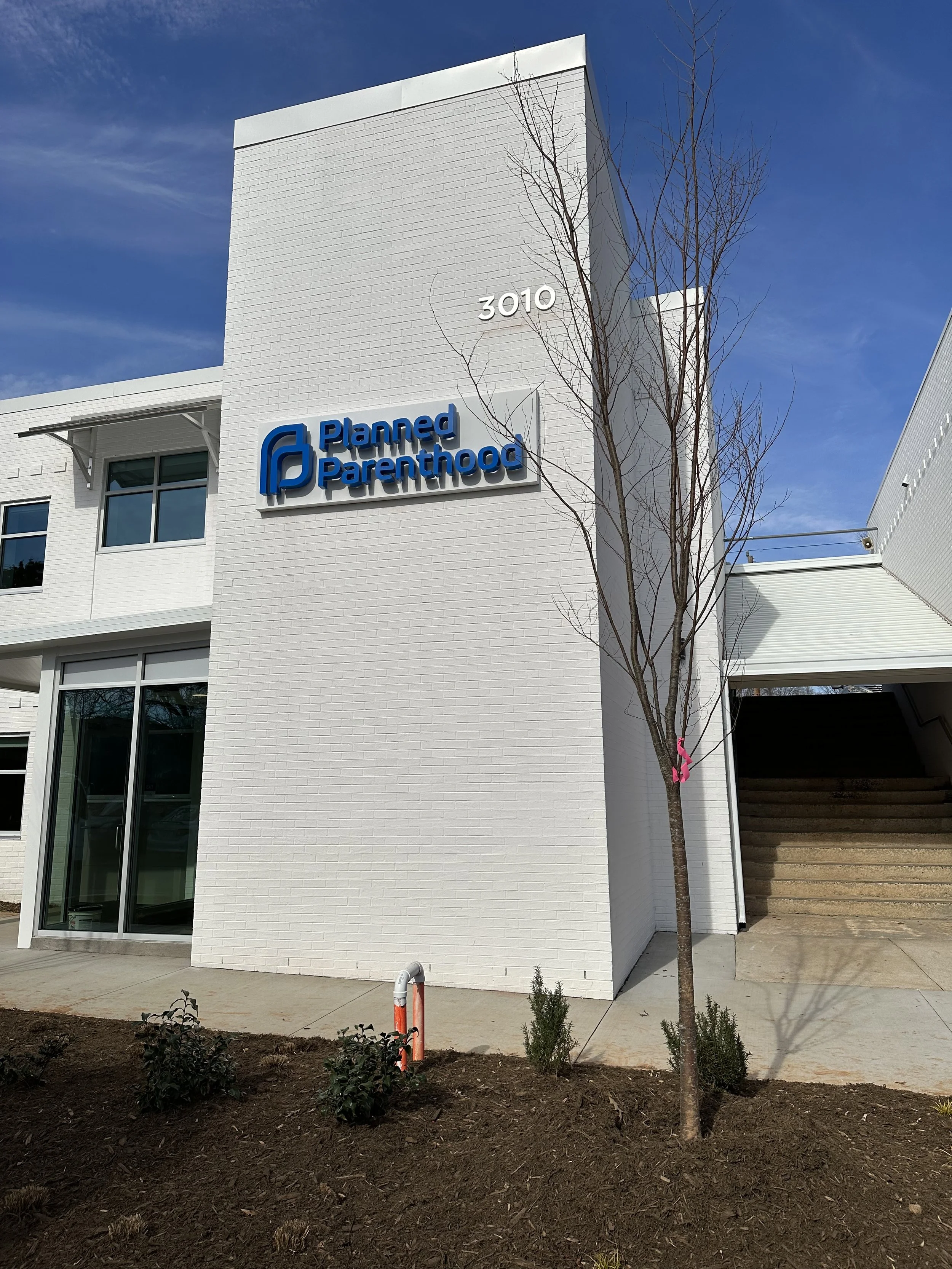
Designing a Healing Space: Inside the Renovation of Winston-Salem’s Planned Parenthood
At Blackwell & Jennings, I believe design can transform more than just how a space looks, it can shift how people feel. This project with Planned Parenthood in Winston-Salem was one of the most meaningful of my career. It wasn’t just a healthcare renovation. It was a reimagining of what care can feel like the moment someone walks through the door.

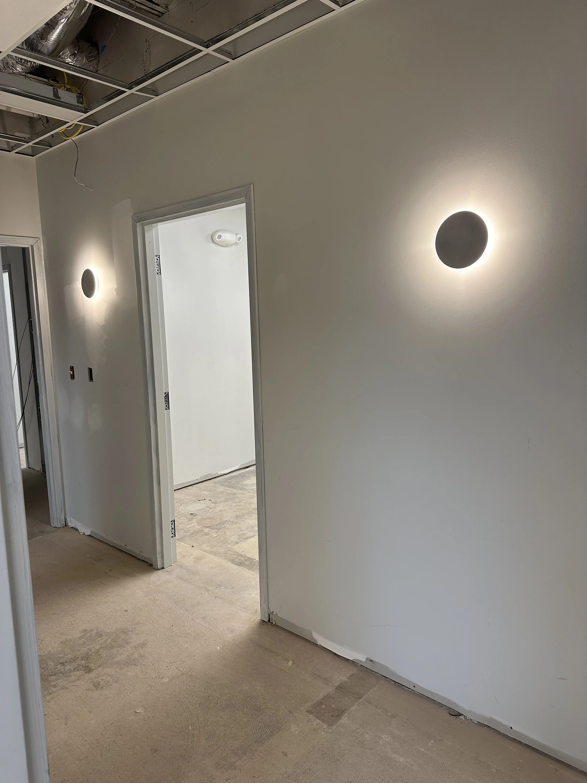
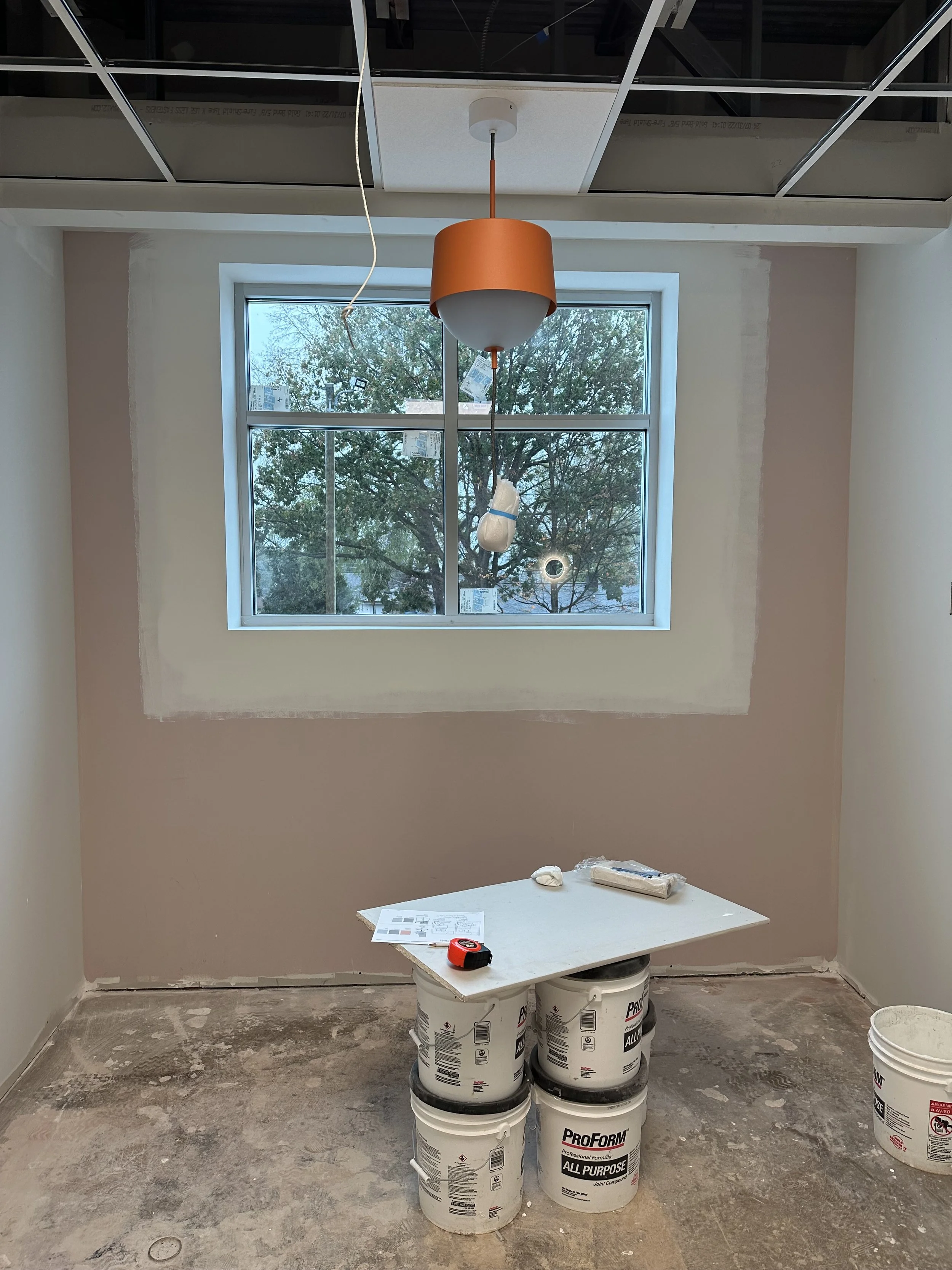
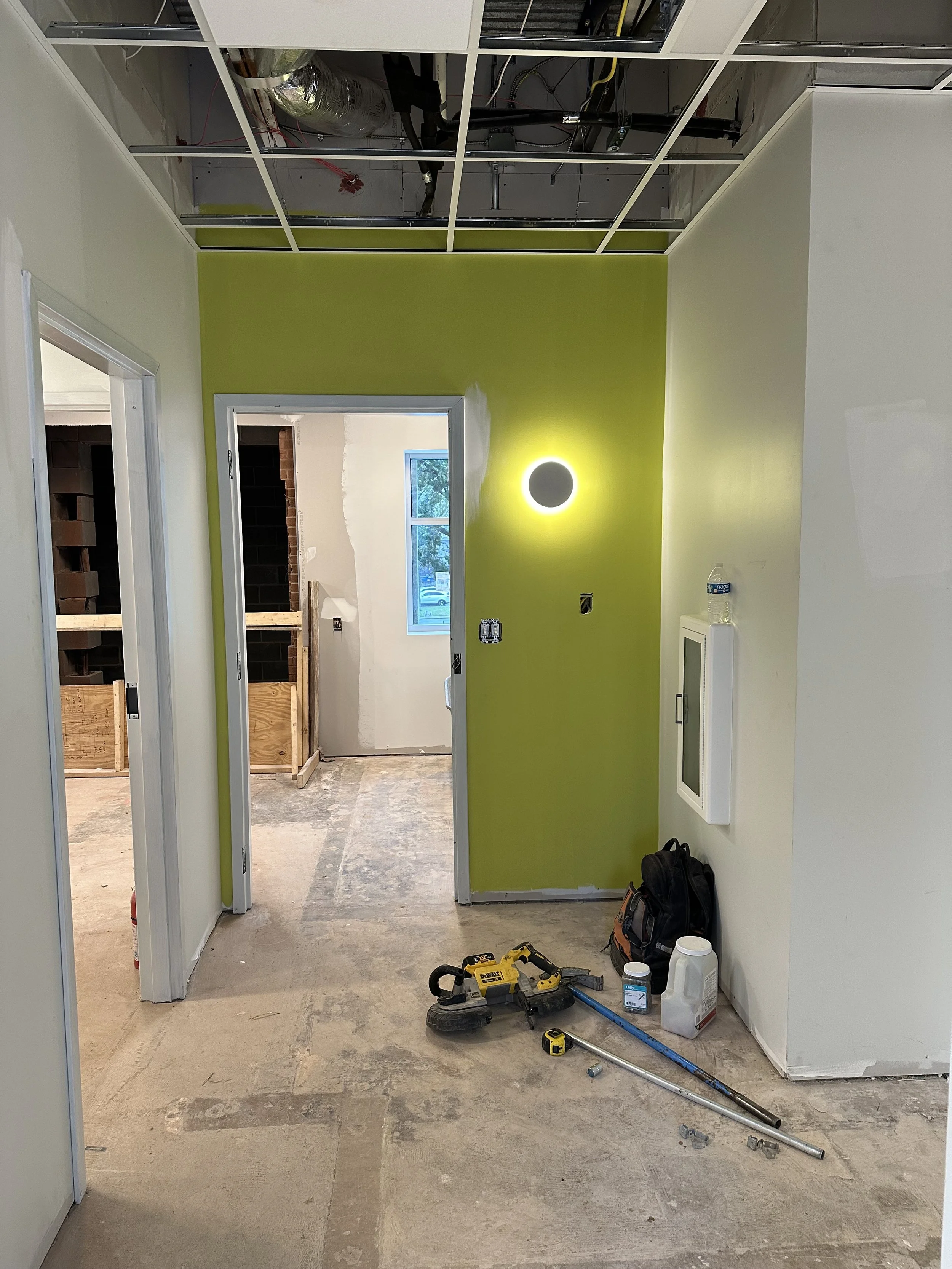

““There’s nothing more satisfying than a good progress shot—watching a space evolve layer by layer is like seeing a vision come to life in real time.””
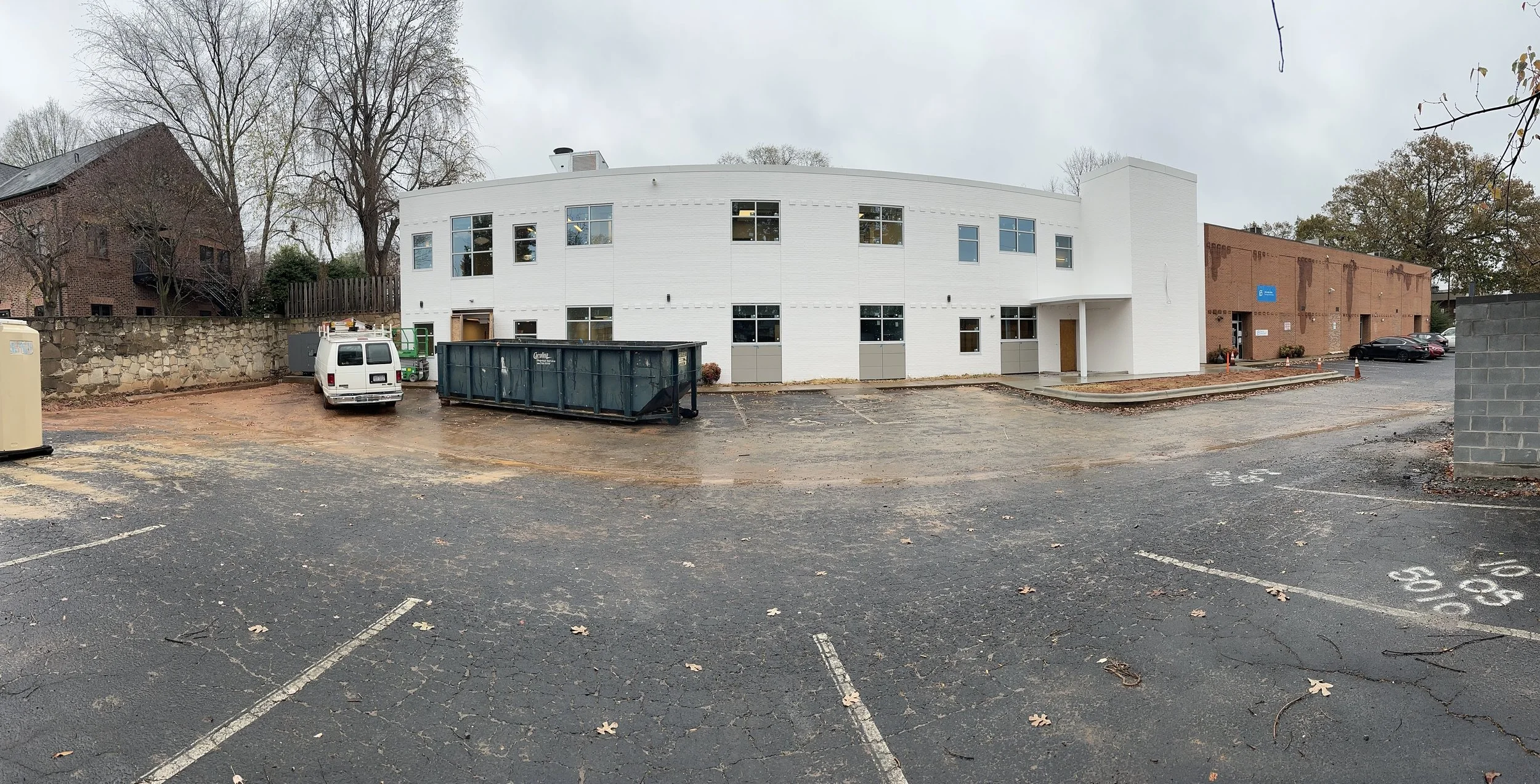
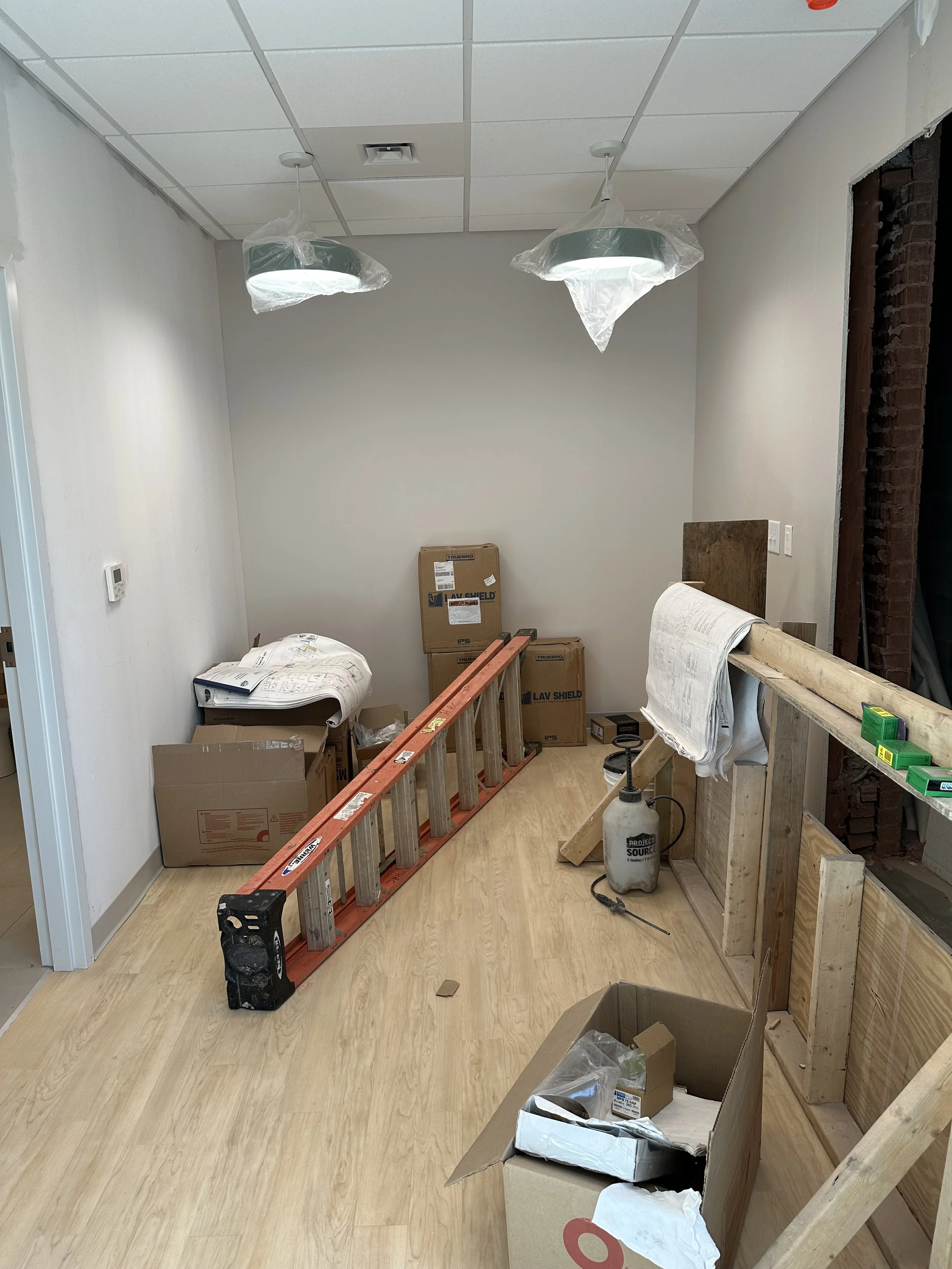
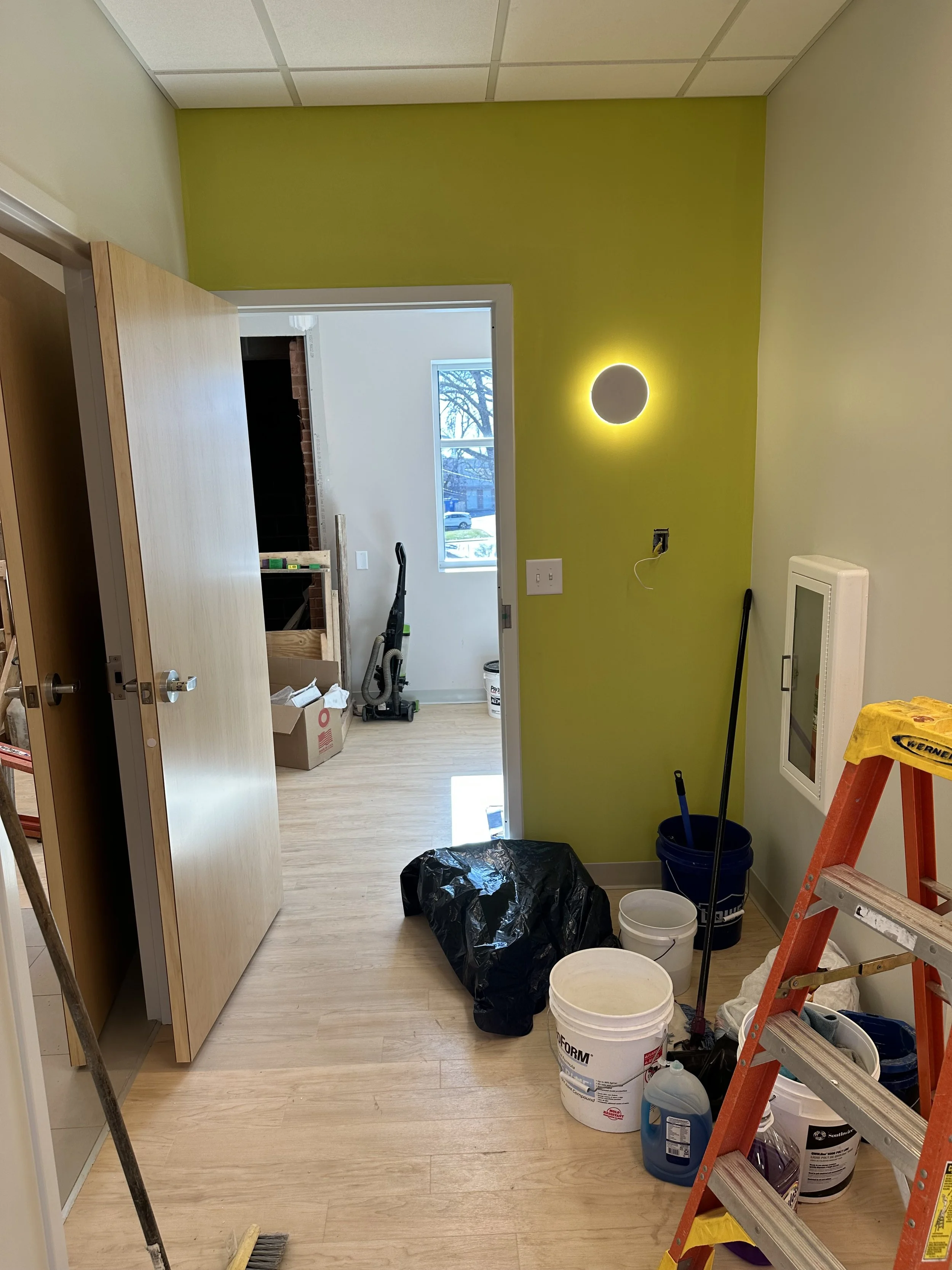
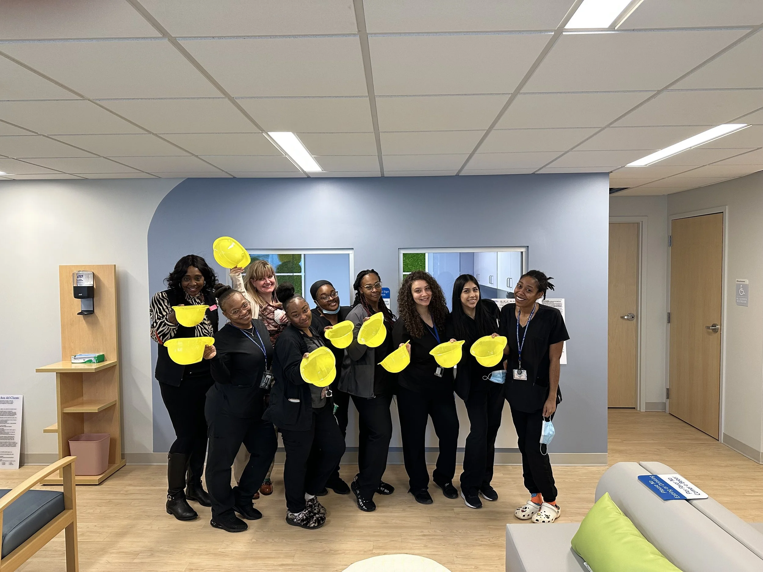
This wasn’t a quick refresh. It spanned almost four years, involved multiple architects, and came with plenty of challenges, including budget constraints and a 1970s building that wasn’t exactly built for natural light or modern flow. And toward the end of the project, while I was installing furniture and accessories, I was also going through chemotherapy after being diagnosed with breast cancer. So yeah…this one goes deep for me.

To help capture the story of the space, I brought in photographer Liz Nemeth @liznemethphoto, whose lens is soft, honest, and emotionally grounded. I didn’t want sterile marketing shots. I wanted images that felt lived-in and real- just like the space itself.

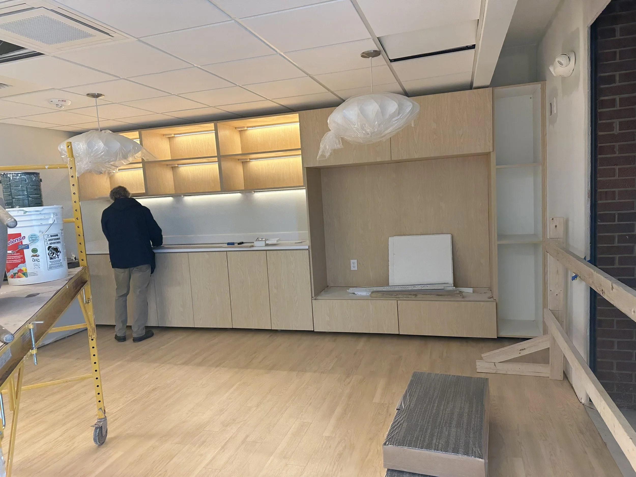
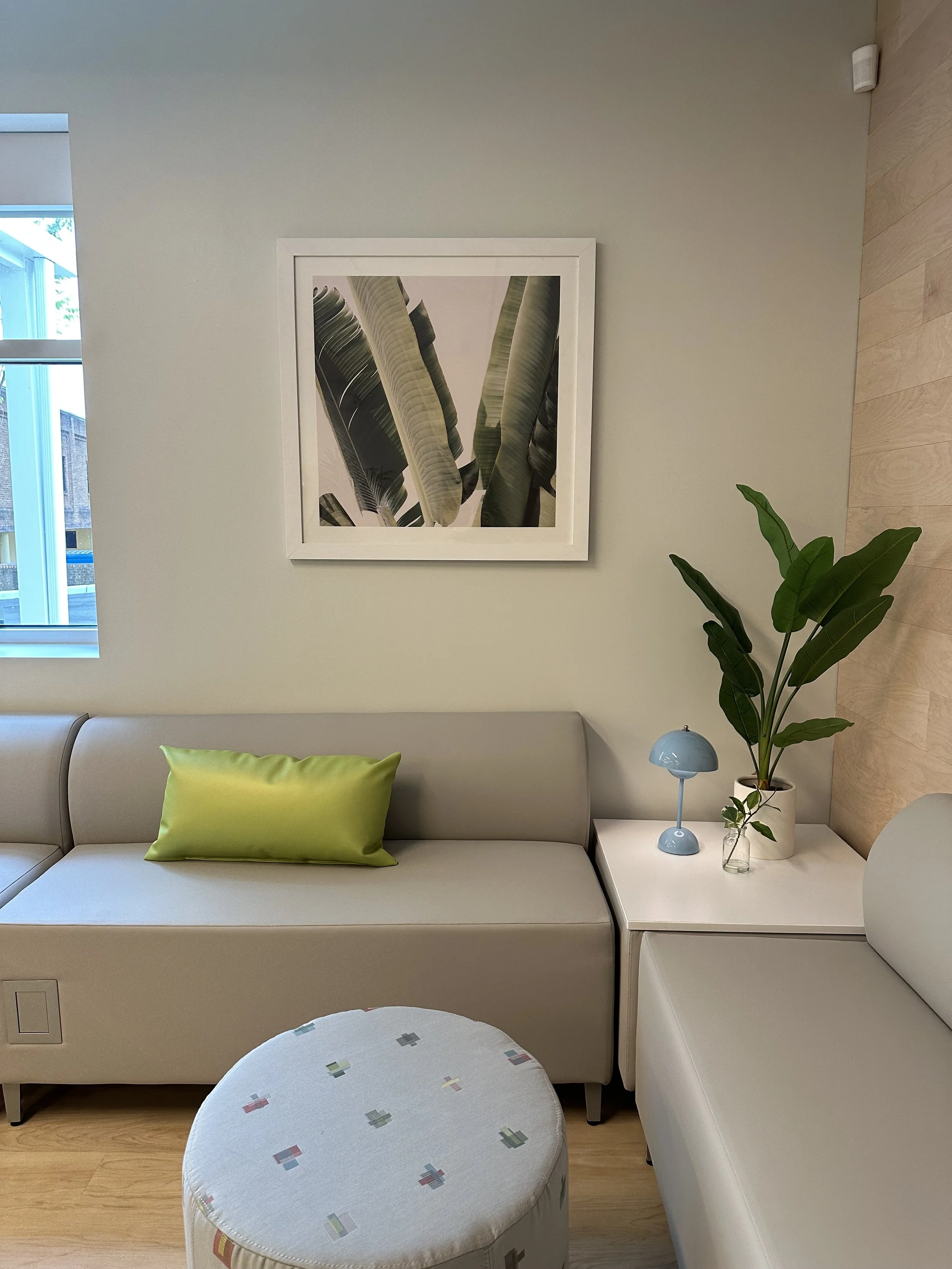
The Waiting Room
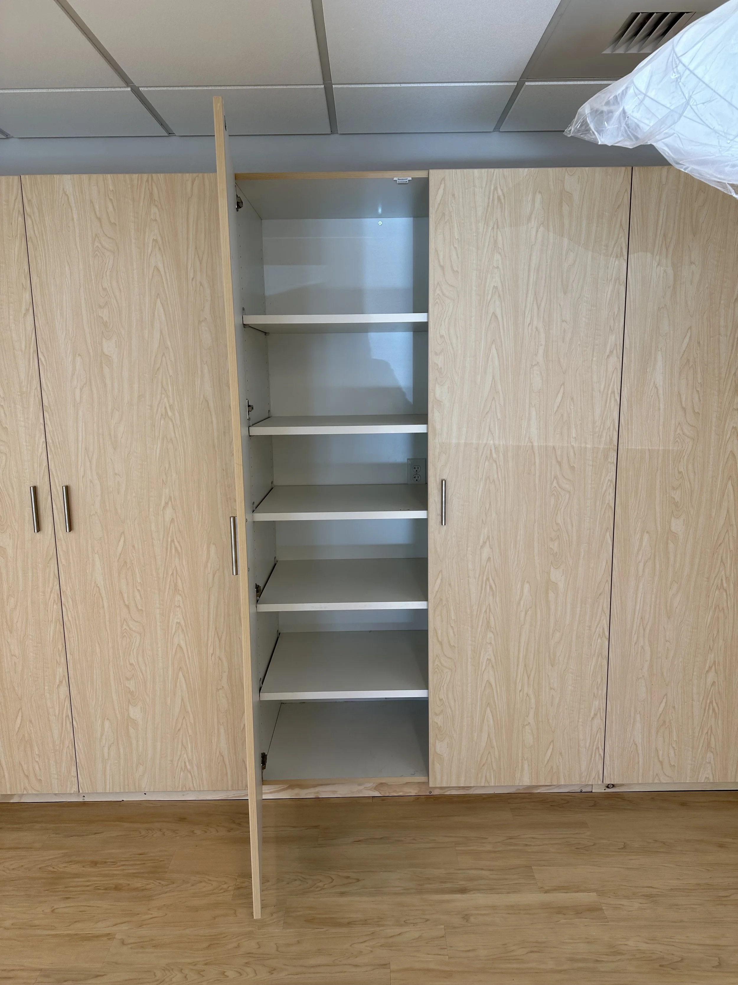
This might be one of my favorite waiting rooms I’ve ever designed. It’s anchored by custom built-in shelving with integrated lighting, a place to display books, ceramics, and calming objects. It doesn’t feel clinical. It feels collected. Human. Thoughtful.
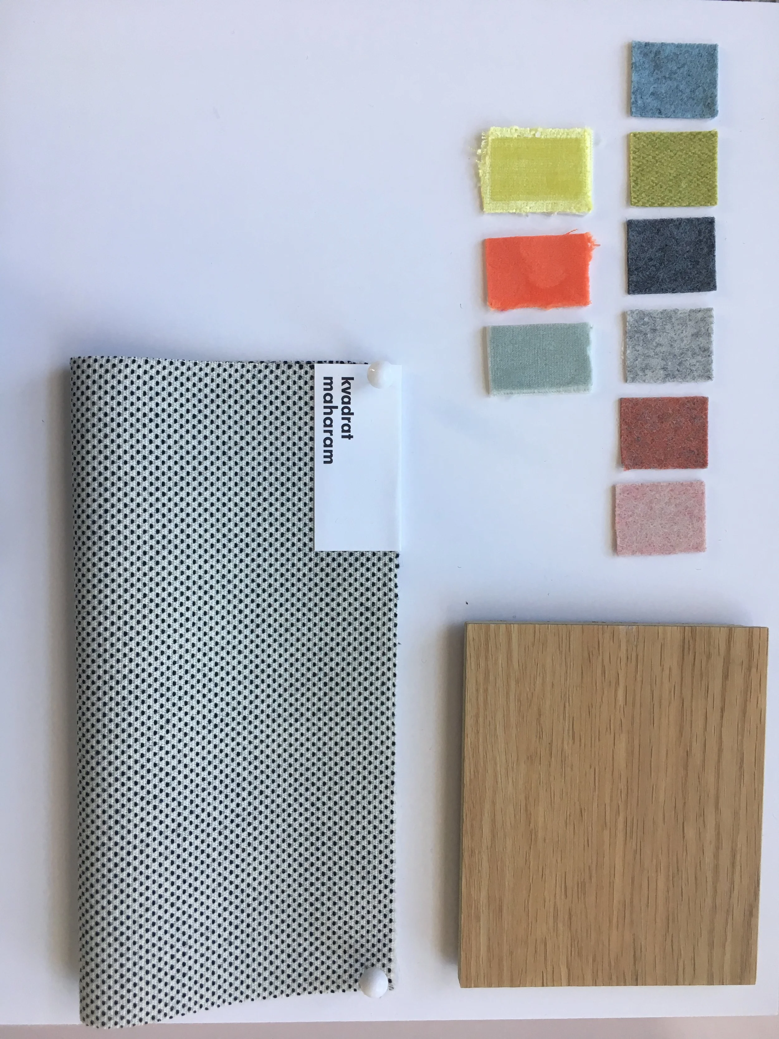
We used Momentum’s Silica fabrics throughout the space, commercial-grade, bleach-cleanable, and soft to the touch. There are also two oversized bright green privacy chairs that I jokingly call “the showstoppers.” They’re bold, beautiful, and give people the option to sit more privately while waiting.
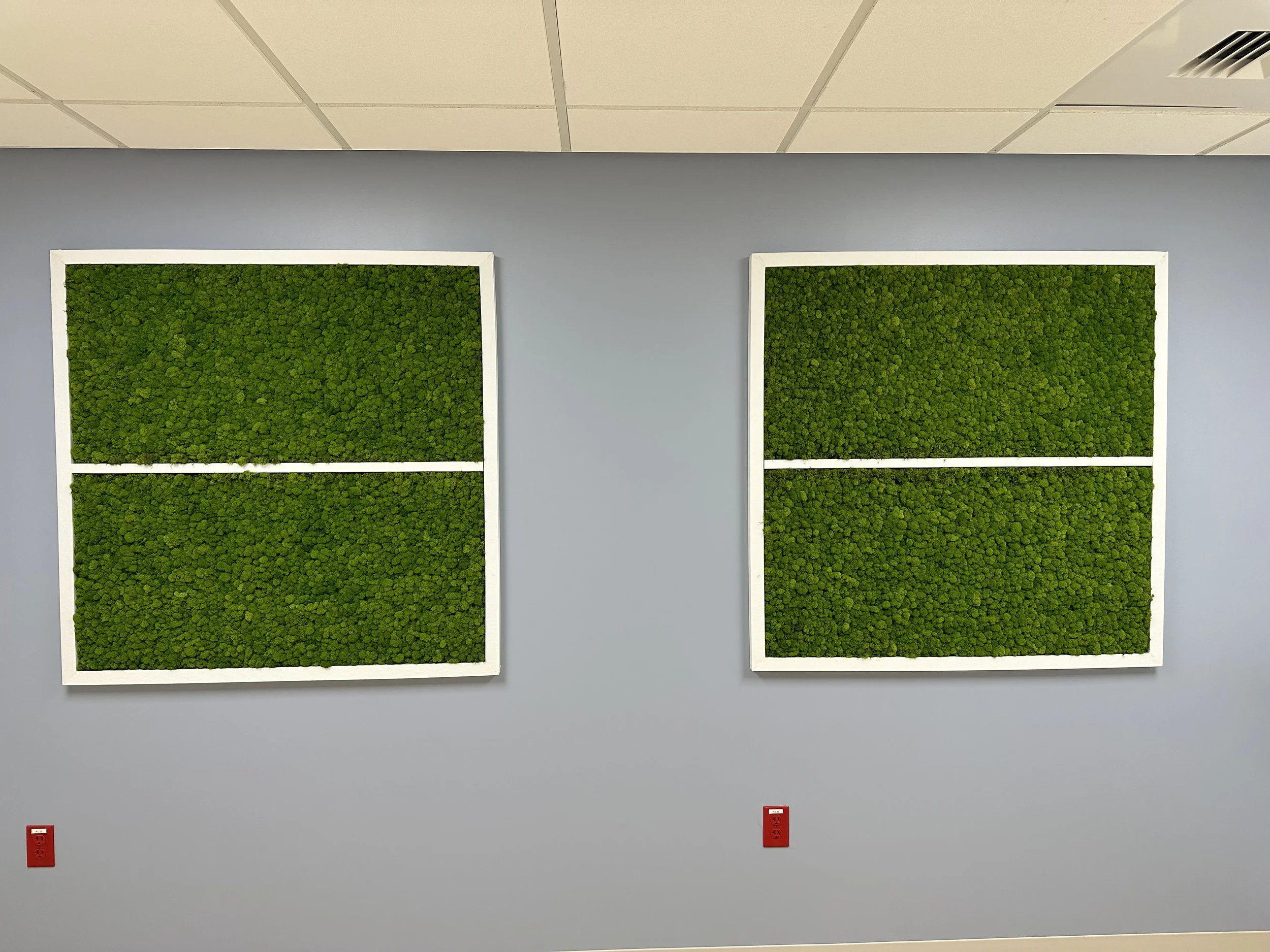
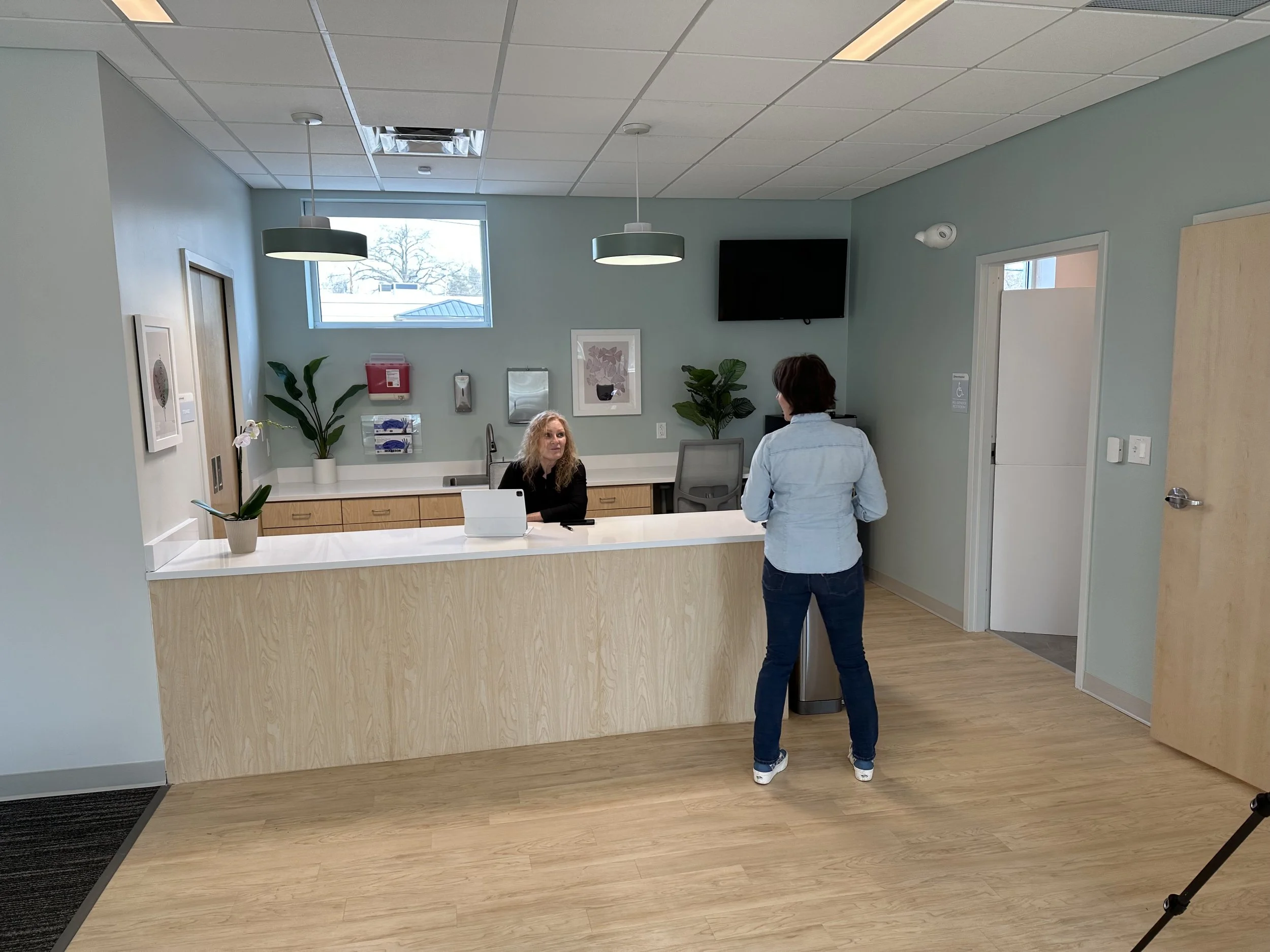
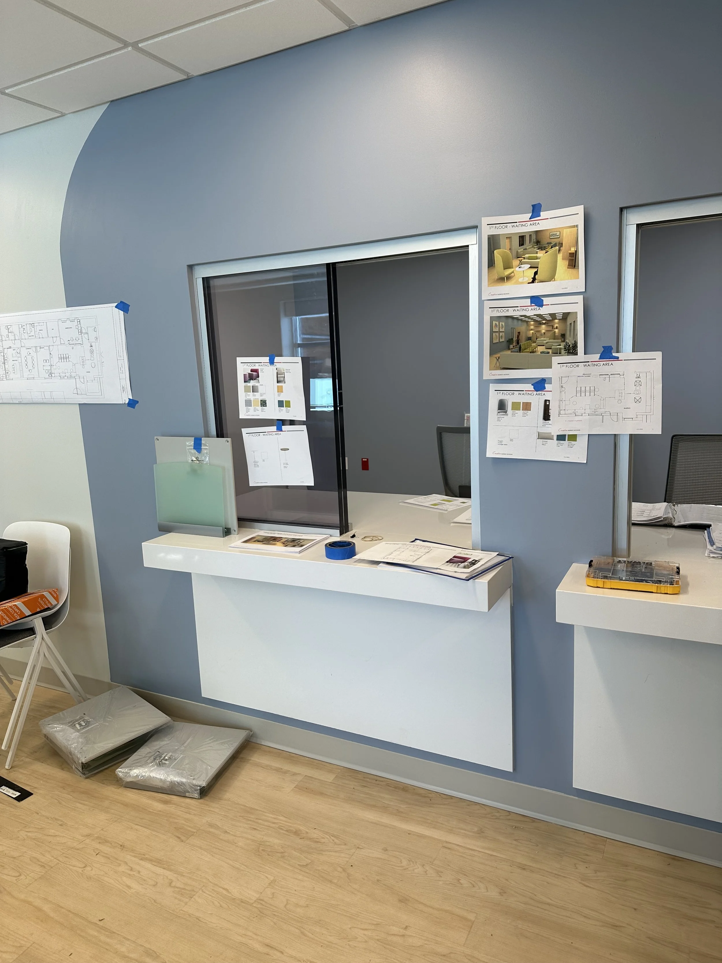
Even the check-in area got a glow-up. It’s wrapped in bulletproof glass, but you’d never know it. We used clean-lined millwork, quartz countertops, and added a wall of biophilic art from Bio Canvas to bring softness and nature into the space. The overall feeling is safe and soothing.


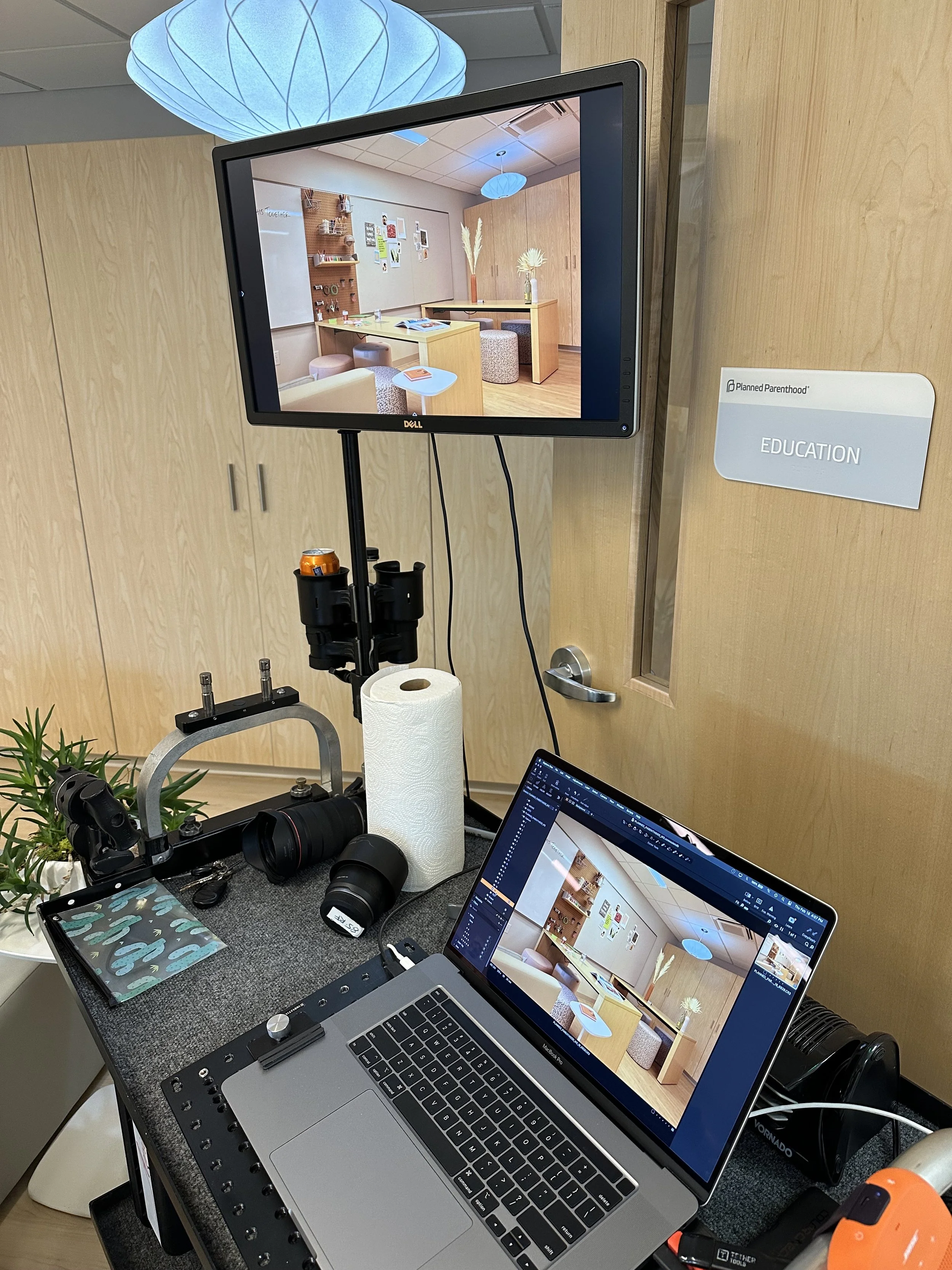
Education Room
This room was created with teens in mind, bright, flexible, and stocked with art supplies. There’s storage everywhere, USB access at desks, and tack boards for showcasing creativity. The seating is modular and square-shaped, you can sit, lean, or sprawl on them however you want.
We pulled in vibrant colors, especially orange, which—according to color theory, stimulates creativity and emotional expression. It was important to me that the room felt dynamic and alive. You can feel the energy shift the moment you walk in.

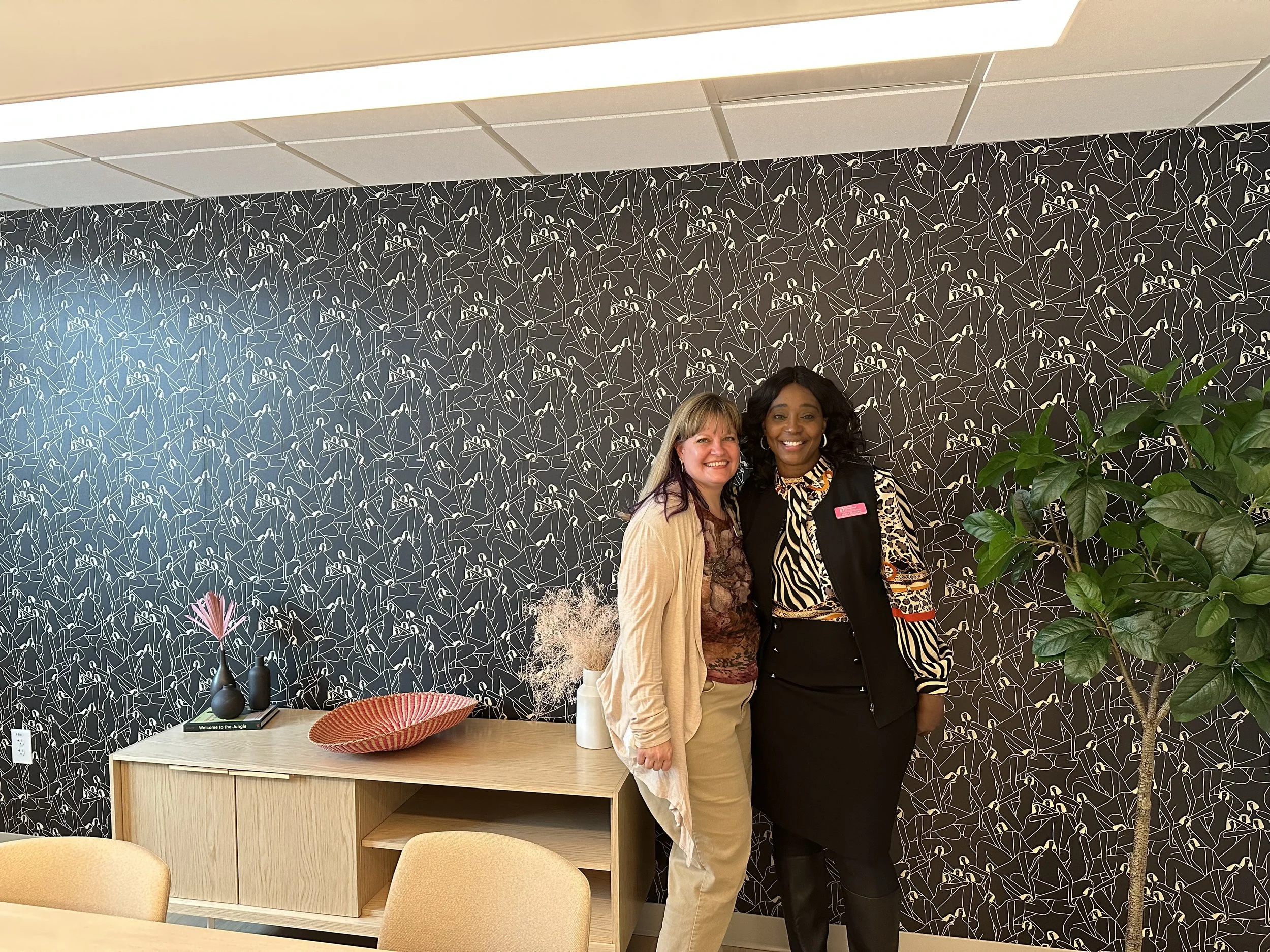
Conference Room
This space is modern and minimal, with one cheeky twist: the wallpaper. Designed by Laura Berger, @_lauraberger_
It features soft, abstract, feminine shapes. The staff affectionately refer to it as “the orgy wall”—which cracked me up and instantly made me love them even more. It’s proof that wellness design can have personality, humor, and edge while still being beautiful and intentional.
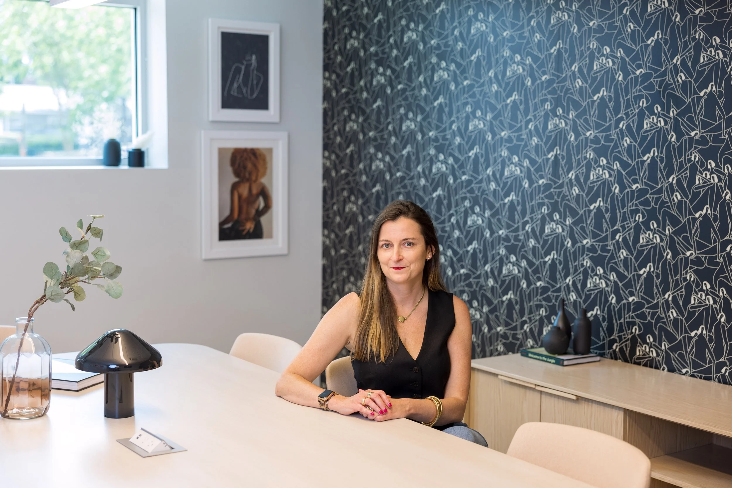
Interior designer, Heather Jennings
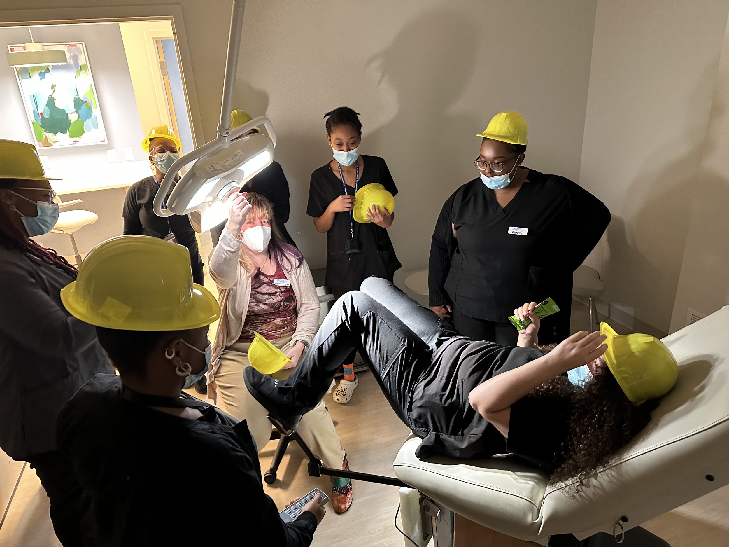
The Health Center + Exam Rooms
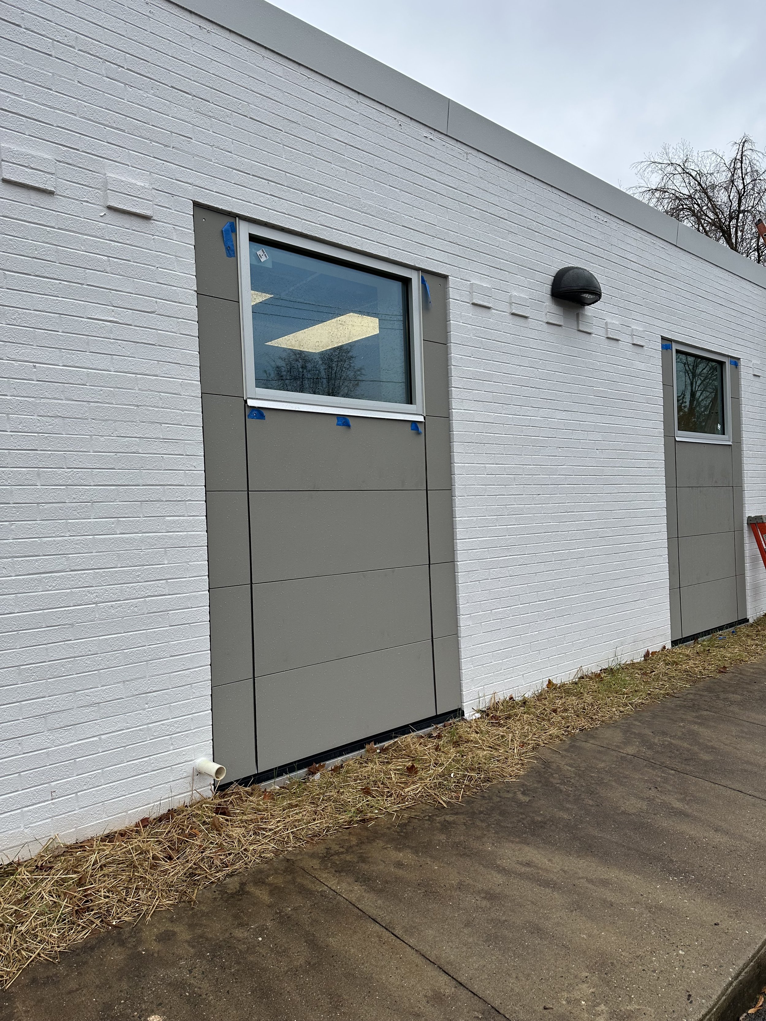
Because the building was originally built in the 1970s, one of the biggest design priorities was to bring in natural light. I fought hard to get new windows installed throughout the entire facility, even in the exam rooms. They literally had to cut through brick, but now every space is filled with daylight. It’s not just beautiful, it’s backed by research. Natural light supports faster healing, lowers stress, and improves overall wellbeing.
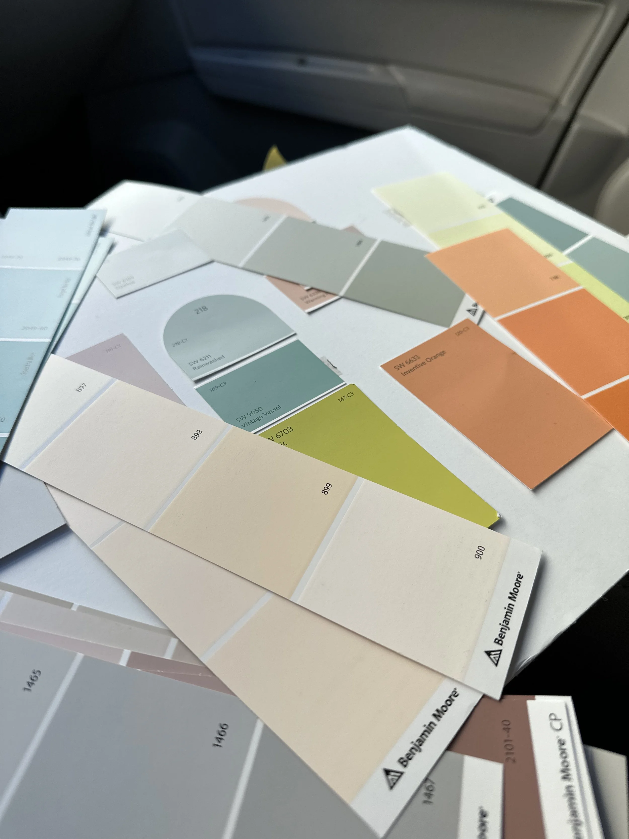
The color palette throughout is soft but not sterile, grayed-out pinks, muddy teals, warm whites. Bathrooms are covered in youthful blue tile that gives a boutique coffee shop feel. In the recovery spaces, we used natural wood tones and inclusive art to help people feel grounded and seen.

Why This One Matters
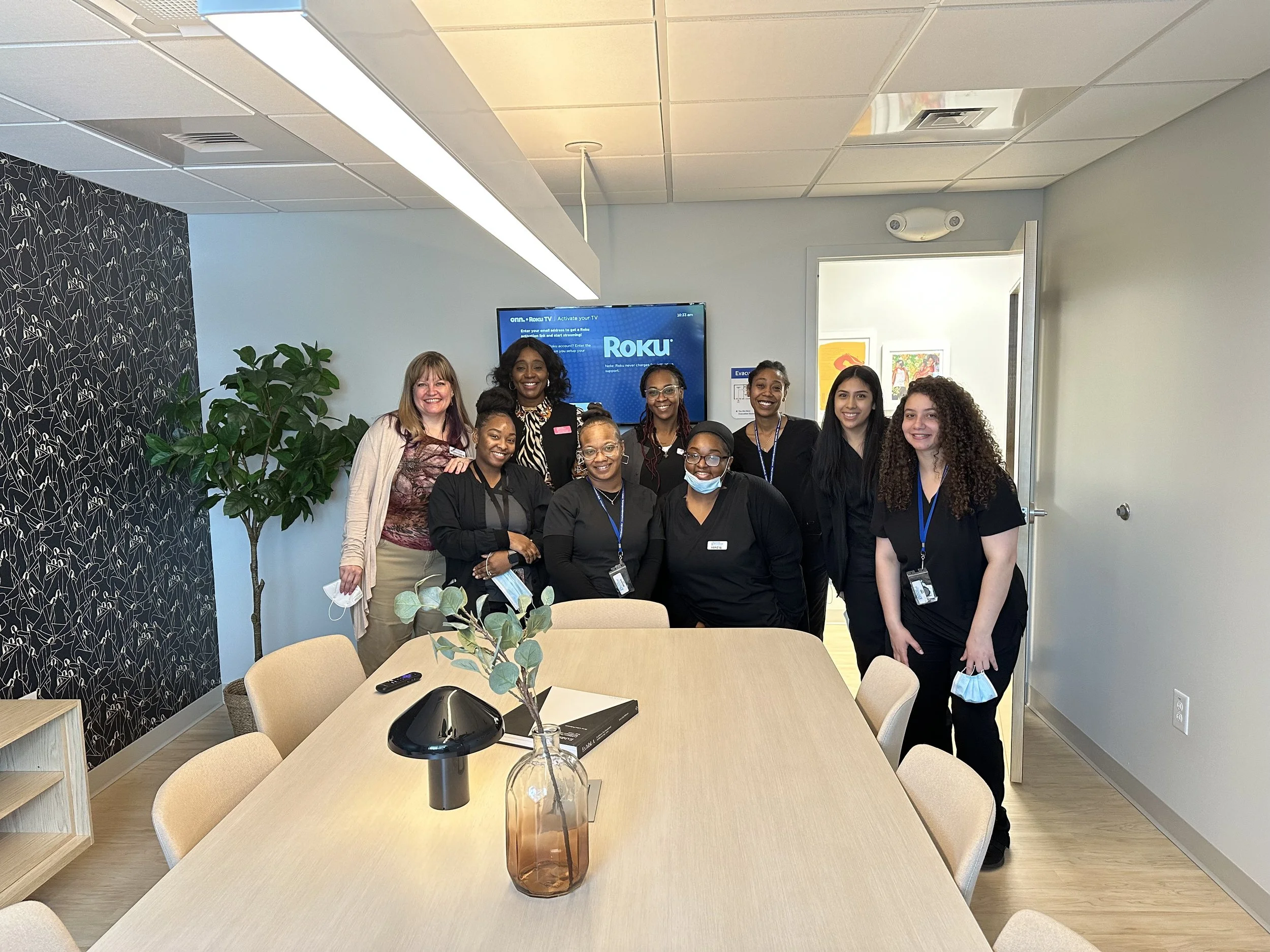
This project was a labor of love. I was managing chemo treatments while installing finishes, and somehow, that challenge made everything more personal. The staff at Planned Parenthood do incredible work every day. They provide compassionate care to people of all genders, especially those in vulnerable situations, and they needed a space that reflected that level of care.
The old space was in a basement. It was small, dark, and gloomy. This new space is filled with light, warmth, and intention. And honestly? They deserve it.

I’ve learned so much designing for this client, about dignity, access, resilience, and the quiet power of beauty. And I’m just so proud to have played a part in creating a space that feels like care.